
It’s been about two weeks since the 2023 blockbusters Barbie and Oppenheimer hit cinemas, sparking fan theories that combine both films in the pop zeitgeist. Whilst some fans choose to pick apart the messages and morals of the films, others have noticed patterns within and beyond the realm of the narratives. One example that has made head waves is the Barbie/Oppenheimer US Electoral Map.
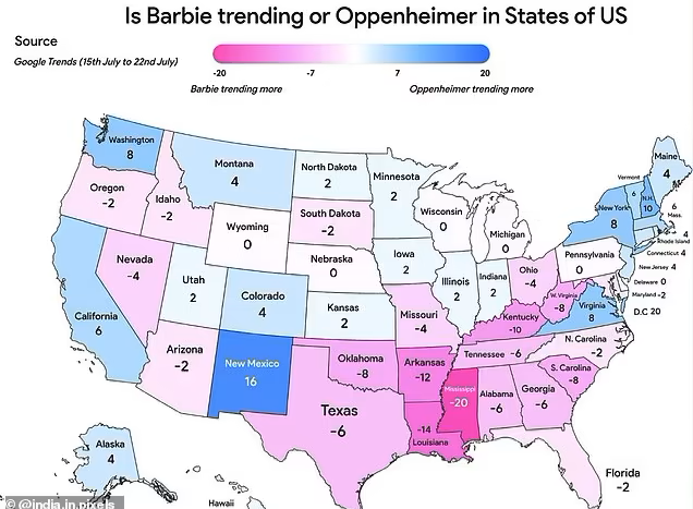
Some fans of the Barbenheimer duo have used data from Google Trends to map out the popularity of each movie in the United States, which, admittedly, looks quite similar to the US 2020 electoral map. The ‘Barbie’ states appear to overlap heavily with historic Republican strong holds, whereas the Oppenheimer states frequently go Democrat. There are a few discrepancies; Barbie’s Oregon hasn’t voted for a Republican president since 1984, whereas Oppenheimer’s Montana has strong Republican ties. However, the general pattern, which depicts Oppenheimer northern coastal states and a Barbie belt in the south, has spawned many theories of how US political leanings could impact movie choices. To which, we at Whycatcher have thought, what a good time to discuss spurious correlations!
What is a spurious correlation?
If you’ve ever heard the phrase, “correlation does not equal causation,” you will be well on your way to understanding spurious correlations. These correlations represent two pieces of data that appear, at first, to suggest a causal relationship. However, upon closer examination, their patterns can be explained either by coincidence, or by a third causal property.
Spurious correlations can confound data scientists by acting as red herrings – offering insights or explanations that may be less statistically probable than sheer coincidence. Sometimes, these correlations lead to predictive models – other times, they seem to suggest unlikely shared causalities. Frequently, spurious correlations lead to some quite humorous charts, theories, and comparisons. Let’s take a look at two examples: the Hemline Index, and the Mozzarella-Doctorate correlation.
The Stock Market Hemline Index
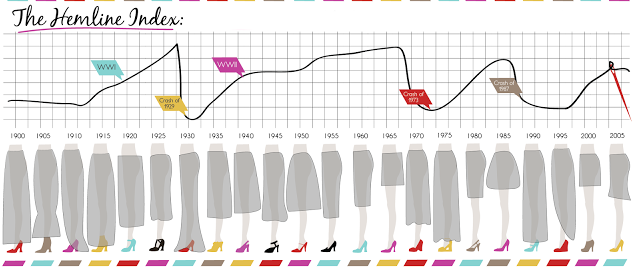
The more motivated a data scientist is to predict something, the more likely they are going to find some wacky correlations. As such, the stock market is frequently predicted across a myriad of potential data points – including women’s hemlines.
The hemline index was first proposed in the 1920s, as women’s skirts began to rise with the increase in fiscal prosperity in the US. According to the theory, the direction of women’s hemlines can predict the direction of the market. A bullish (rising) market in the 60s tied in with the popularity of the miniskirt, whilst a bearish (dropping) market in the 70s hit just as trousers came into fashion.
So, does the index hold water? It depends who you ask. Some believe there is a reverse-causal relationship: when the economy is spiking, designers allow themselves to create garments with larger portions of fabric. The economy inevitably takes a down turn, just as these styles take off, and the cycle reverses itself as designers skim off the hemlines. This theory, however, would not demonstrate hemlines as predictive – in fact, it would be the stock market that would predict the styles!
There’s been about a dozen variations on the hemline index. Men’s underwear has predictive index, as do women’s haircuts and Superbowl winners. But, just as with the hemline index, these predictive models rarely prove genuine, and are far more likely to impact the behaviour of their followers. If you believe stocks are about to crash because you’ve seen long skirts on your walk into the office, your fearsome selling may trigger a market decline. The relief you feel from a sundress may equally calm other proponents of the theory, bringing you and others to hold and buy, revitalising the market. But this phenomenon can only prove profitable if there is a market consensus over the reliability of the index – of which there is surely not. So, if you find yourself eyeing up the skirts of your neighbours before making major financial decisions, we would recommend reaching out to a financial consultant instead.
The Mozzarella Doctorate
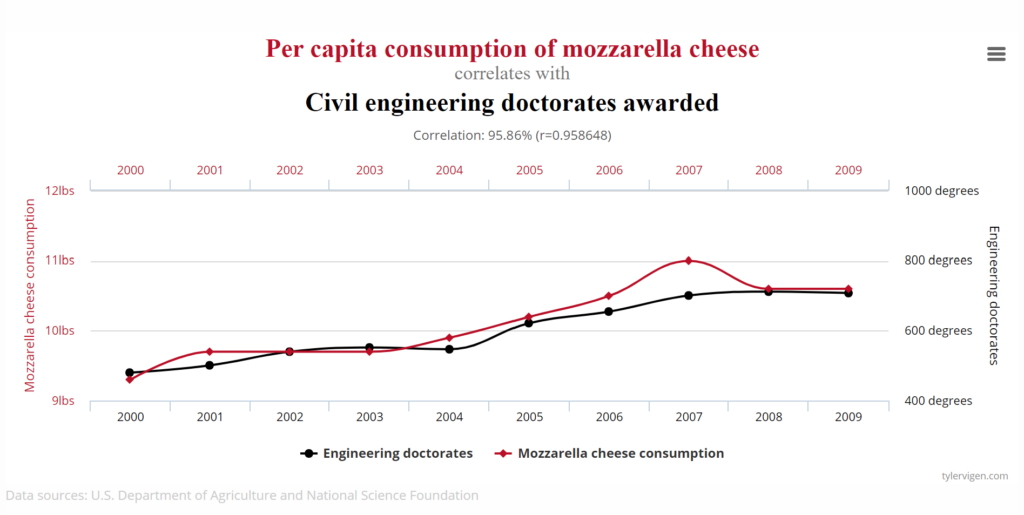
Spurious correlations can often be best depicted by demonstrating a similar trend between two completely unrelated data sets. Take this example, by Harvard law grad and spurious correlation fan Tyler Vigen, demonstrating the correlative relationship between Mozzarella consumption and the awarding of civil engineering doctorates in the US.
Do these two pieces of data have a causal relationship? Perhaps – they both demonstrate relatively steady upward trends with a slight decline around 2008, suggesting economic prosperity may have favoured academics and cheesemongers alike. However, this causality is extremely broad – the economy is likely to impact a wide variety of national trends, whereas a strike in dairy farming may be less likely to predict how many people are successfully able to attend to their engineering degrees. All in all, this data may be in part impacted by a common causal relationship, but it seems unlikely to say it’s all the mozzarella fans who are getting their doctorates.
Meaning in the madness
So, is the Barbenheimer electoral map another example of a spurious correlation? It’s hard to tell without doing a whole lot more data trawling to find out why people in certain states like Barbie or Oppenheimer so much. Much like the hemline index, there will be many theories floating around trying to explain the phenomenon. Politics can influence (or can be influenced by) people’s interests, which could hint at a causal relationship between the two. Or perhaps the incentives people have to live in a given state overlap with the demographic each film is catered to. Barbie’s target audience of young women may be driven to southern states for their university campus culture. Yet, at the end of the day, this may just be another cheese with an engineering degree…
At Whycatcher, we love digging to find out what’s really at the heart of our data. And, unlike the stockbrokers in Vogue, we have no problem recognising when a story is just too good to be true. For as fun as a spurious correlation can be, we enjoy the real insights behind our data even better. To find out more, get in touch here.